Page structure
Let's decide what makes a great landing page, do we want Testimonials? Pricing? ....
Last updated
Let's decide what makes a great landing page, do we want Testimonials? Pricing? ....
Last updated
Lightning Landing comes with one landing page design by default. All the sections are carefully designed and placed to guide the visitor toward converting into a user or potential customer. Please feel free to change any existing section with any other design from the following libraries, The boilerplate has DaisyUI and Tailwind by default so any of the components can easily be copy-pasted:
The fixed navigation bar stays at the top of the page and contains your logo, company name, and main menu items.
Pro Tips:
Keep menu items minimal (3-4 items) to avoid overwhelming visitors
Use clear, action-oriented labels
Include your logo and company name for immediate brand recognition
The hero section is the first thing visitors see. Lightning Landing comes with a default split text image hero.
Pro Tips:
A compelling headline focused on value proposition
A brief supporting description
Primary call-to-action button
Social proof elements (user avatars and trust indicators)
Hero image showcasing your product/service Tip: Focus on benefits rather than features in your headline. Use action-oriented language that speaks directly to your target audience's needs
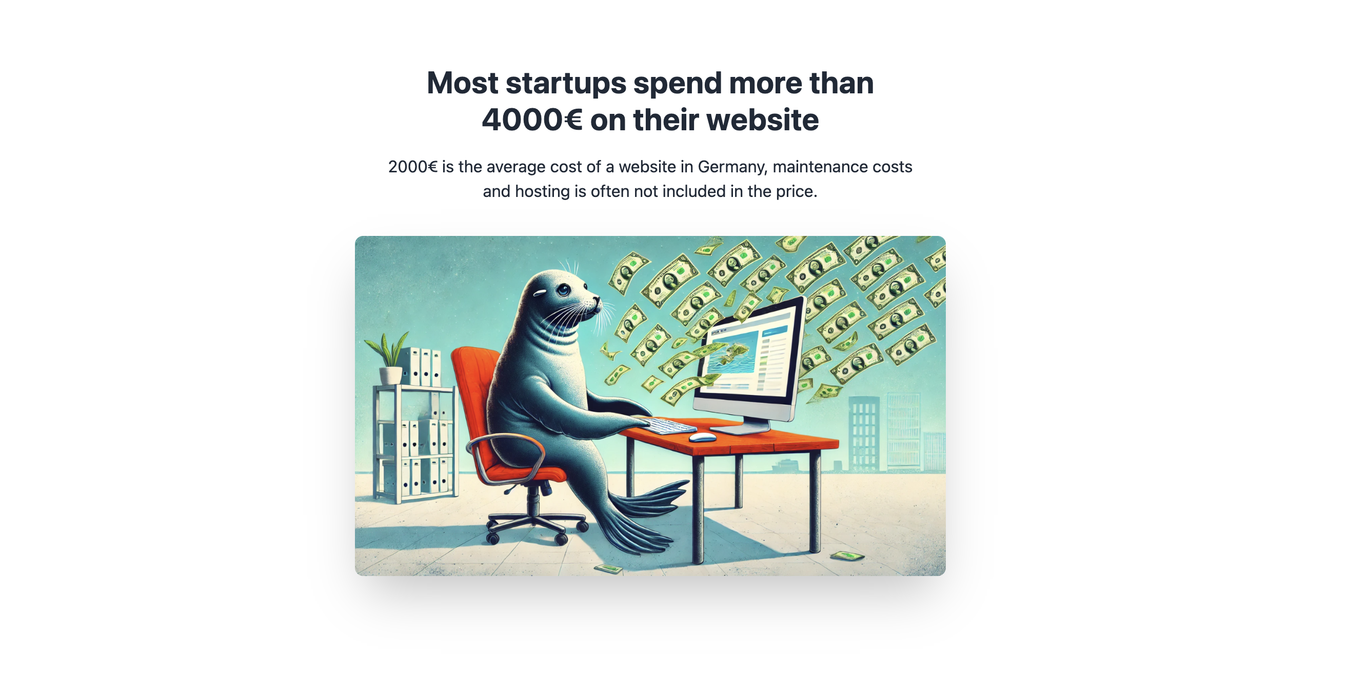
This section highlights the problem your service solves. It comes in second position on the landing page, so users identify with the pain.
Pro Tips:
Uses data and statistics to build credibility
Presents the market average cost
Includes a visual representation of the problem Tip: Use specific numbers and data points to make your argument more convincing and relatable.
A visual grid showcasing your key services or benefits. Use descriptions and visual elements like screenshots or illustrations.
Pro Tips:
Includes high-quality images for each service. Use real project screenshots or high-quality stock photos that align with your services
Many startup pages hide their pricing. This can be frustrating for users who come to your site to assess whether you are the correct option for them. So, if you believe you have competitive pricing, don't hesitate to add it to the homepage. It might increase your conversion rates.
Pro Tips:
Single, focused package to reduce decision paralysis
Detailed list of included features
Prominent display of price point
Clear call-to-action Tip: Highlight the value proposition by comparing your price to the market average
Social proof section featuring customer reviews, if you can get videos on these testimonial cards, your social proof will be as strong as possible.
Pro Tips
Individual cards for each testimonial
Customer photos and ratings, videos are even better
Use real customer photos and testimonials whenever possible. If using placeholders, ensure they look authentic and diverse
Addresses common customer questions, this section is often placed right after the pricing section as it should answer the exact questions that arose from looking at your pricing description. It should do the trick to convert the visitor into a user by clearing any doubts they might have.
Pro Tips:
Base your FAQ on real customer questions and update it regularly as new questions arise
This is the last chance to convert visitors, remind the visitors of your value proposition, and make a clear call to action.
Pro Tips:
Clear, compelling headline
Urgency-creating subtext
Prominent call-to-action button
Reiterate your main value proposition and create urgency with limited-time offers or exclusive benefits
Contains essential links and information.
Pro Tips:
Company information
Social media links
Brand elements
Keep it simple
That's it for the HTML structure of your landing page.
Nest, we will look at how to publish your Landing page for free on Github 🚀